Guía · Audiovisual · Básico · Generación
Una foto de tu producto, ocho anuncios distintos
De UNA sola foto de tu producto sobre fondo neutro salen ocho anuncios con estéticas distintas: la de catálogo, la que detiene el scroll, la que la gente comparte, la editorial, la que parece foto de cliente, el macro, la del origen y el espectacular en la calle. Ocho prompts completos, uno por fórmula.
¿Qué es esto y cómo lo uso?
Una guía paso a paso. Síguela de arriba hacia abajo desde tu celular; no descargas nada.
Objetivo
Convertir UNA sola foto de tu producto —bien iluminada, sobre fondo neutro y con la etiqueta legible— en OCHO anuncios distintos, cada uno con una fórmula visual diferente y un trabajo diferente que hacer: el héroe de catálogo, la explosión de ingrediente que detiene el scroll, la escala imposible que la gente comparte, el producto como paisaje editorial, la mano real que no parece anuncio, el macro sensorial, el flat-lay del origen que justifica el precio y el espectacular con el que le cierras la venta a un cliente. Todo con un bloque de bloqueo del producto que se pega igual en los ocho y una escena que no se toca.
Qué logra
De una sola foto de tu producto sobre fondo neutro salen ocho anuncios distintos, cada uno con una estética diferente y un trabajo diferente que hacer: la de catálogo, la que detiene el scroll, la que la gente comparte, la editorial, la que parece foto de cliente, el macro que da hambre, la del origen artesanal y el espectacular en la calle.
No son ocho versiones de la misma foto. Son ocho fórmulas visuales, y cada una vende por una razón distinta. Un negocio que sube siempre la misma foto de catálogo está usando un octavo de lo que tiene.
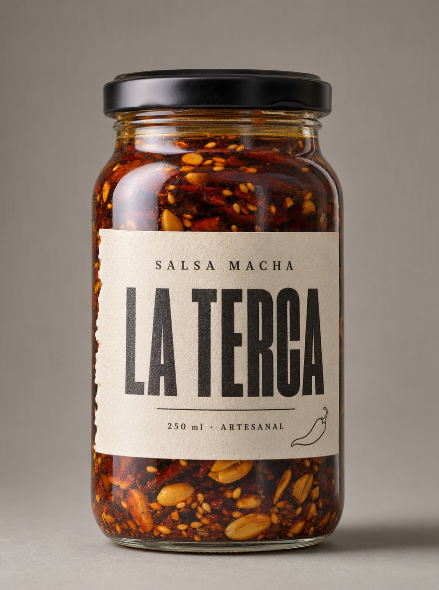
Este es el punto de partida real del ejemplo: una foto de producto limpia, centrada, fondo gris neutro, etiqueta legible. Nada más.
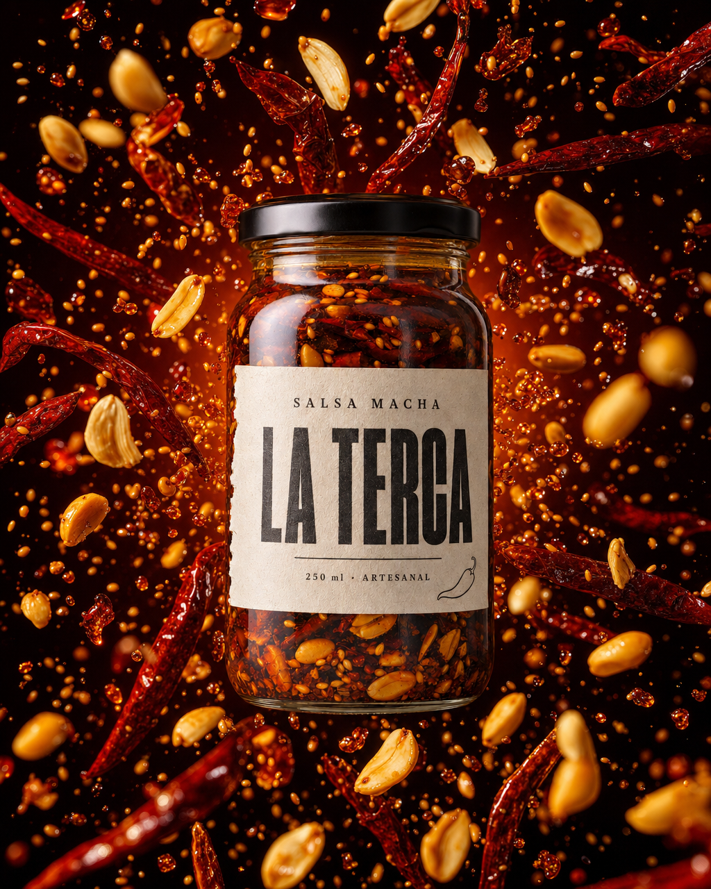
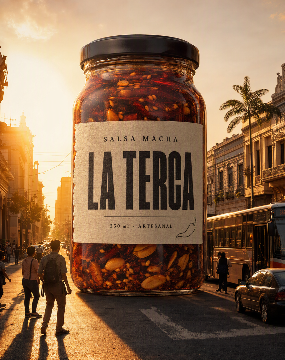
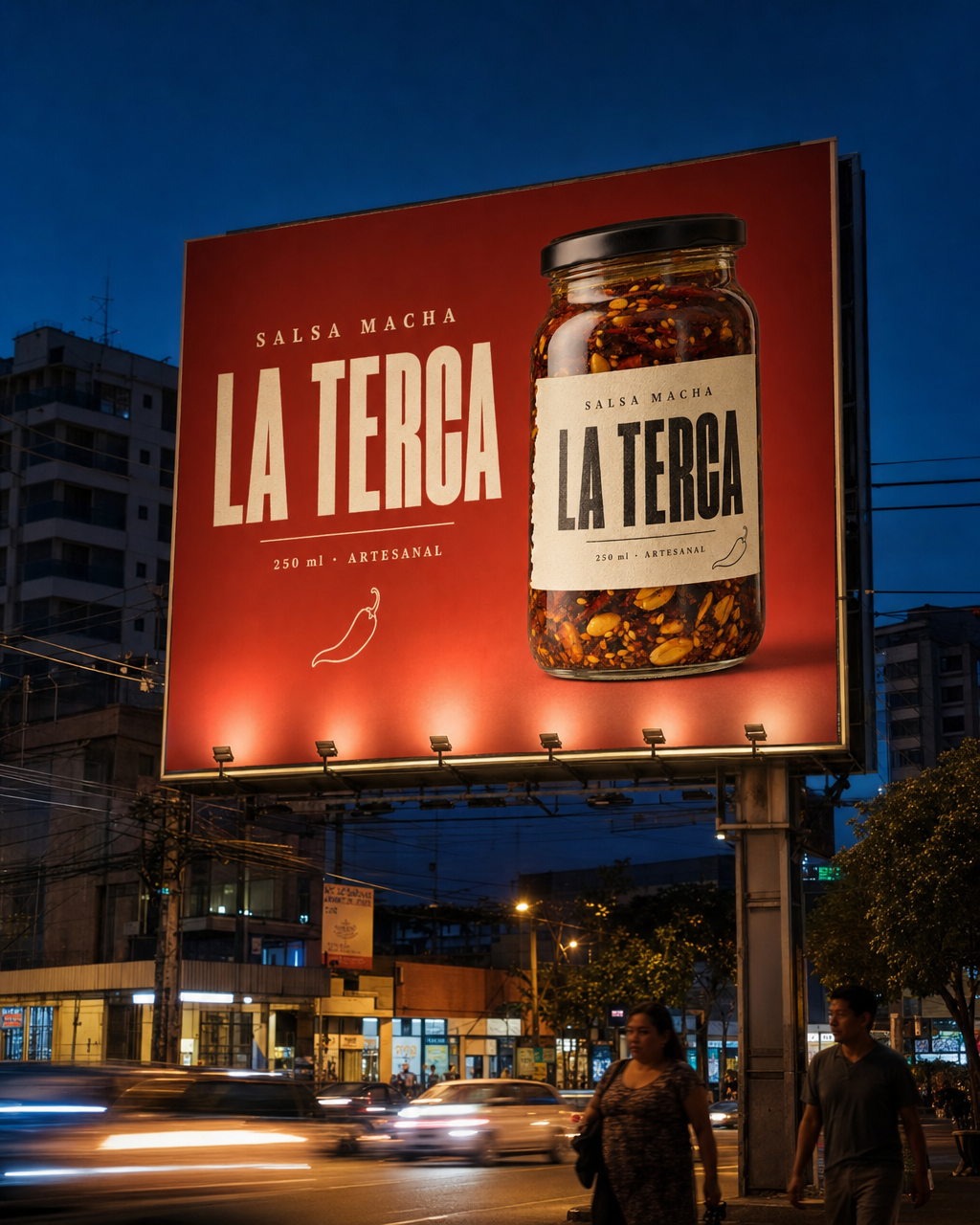
Y esto es lo que sale de ella con tres de las ocho fórmulas:
Lo que necesitas
Una sola foto de tu producto. Con dos requisitos que no se negocian:
- Bien iluminada y con la etiqueta legible de punta a punta. Lo que no se vea nítido en tu foto, el modelo se lo inventa — y lo primero que se inventa es la letra chica de la etiqueta.
- Fondo neutro y liso, producto derecho, de frente, a la altura de la etiqueta. Sin props, sin manos, sin otros objetos en cuadro. Mientras más limpia sea la foto de partida, mejor viaja el producto a las ocho escenas.
Si ya tienes esa foto, salta a las fórmulas. Si no la tienes —o tu producto todavía no existe físicamente— este es el prompt con el que se generó la del ejemplo desde cero. Fíjate en el nivel de detalle con el que se describe la etiqueta: cada palabra que quieres que aparezca impresa hay que escribirla.
Ver el prompt completo ↓Plegar el prompt ↑
$ Professional product photograph of a single artisanal Mexican hot sauce bottle, shot as a clean e-commerce reference image.

THE BOTTLE: a squat, wide-shouldered clear glass jar of about 250 ml, the kind used for salsa macha, with a matte black metal screw cap. The glass is filled with a deep brick-red chili oil in which you can clearly see suspended solids settled at different heights: whole toasted chile de arbol pieces, sesame seeds, peanut halves and slivers of garlic. The oil is glossy and slightly translucent where the light passes through it, dark and rich in the shadows.

THE LABEL: a single rectangular paper label wrapped around the front of the jar, made of uncoated warm off-white paper with a slightly torn deckled left edge, as if hand-cut. The label design is minimal and confident:
- At the top, in small letter-spaced uppercase serif type, the words "SALSA MACHA".
- In the centre, very large, the brand name "LA TERCA" in a heavy condensed sans-serif, black ink, tightly kerned, occupying most of the label width.
- Below the brand name, a thin horizontal rule, and under it in small type: "250 ml · ARTESANAL".
- In the bottom right corner of the label, a tiny simple line drawing of a single chile pepper, drawn in one continuous black stroke.
The printing looks like real letterpress on textured paper: slightly uneven ink, visible paper fibre. The label is applied straight, with one small realistic wrinkle near the edge.

THE SHOT: the bottle stands dead centre, perfectly upright, photographed straight on at label height with a 100mm macro lens. Seamless neutral background in a warm mid grey (#8d8880), completely plain, no props, no text, no other objects. Soft large studio softbox from the upper left creating a long specular highlight down the left side of the glass, plus a subtle rim light on the right edge to separate the bottle from the background. A soft contact shadow under the jar. Shallow but sufficient depth of field: the label is razor sharp and fully legible edge to edge.

Photorealistic, ultra high resolution, commercial product photography, accurate glass refraction, realistic oil viscosity, natural colour. No people, no hands, no additional text anywhere in the frame other than what is printed on the label, no watermark, no logo overlays.Las ocho fórmulas
Cada bloque de abajo es un prompt completo y autosuficiente: lo copias entero, subes tu foto y listo. Todos arrancan igual, con el mismo párrafo de PRODUCT FIDELITY RULE —el bloqueo que impide que el modelo te rediseñe la etiqueta— y luego cambia solo la escena. Ese párrafo describe el producto del ejemplo; en "Cómo adaptarlo" está la versión en blanco para que pongas el tuyo.
1. Héroe absoluto
Las tres claves: luz de estudio · fondo profundo · el producto en un pedestal.
Para qué sirve: es la foto de catálogo, la base de todo lo demás. La que va en el menú, en la ficha de la tienda y en la lista de precios.
Ver el prompt completo ↓Plegar el prompt ↑
$ PRODUCT FIDELITY RULE — non negotiable: use the uploaded image as the exact product reference. The jar shape, the black metal screw cap, the off-white deckled paper label, the brand name LA TERCA, the words SALSA MACHA and 250 ml · ARTESANAL, the small chili line drawing, the typography and the colour and texture of the chili oil with its suspended seeds, peanuts and chili pieces must stay 100% identical to the reference. Do not redesign the label, do not invent or translate any text, do not distort the jar. The product must read instantly as the same product.

THE SHOT: a single hero product shot. The jar stands dead centre on a polished dark stone slab, photographed slightly below label height with a 100mm lens so it reads monumental. Background is a smooth, deep gradient going from warm charcoal at the edges to a soft pool of light directly behind the jar, like a spotlight on a stage.
LIGHTING: one large softbox raking from the upper left creating a long vertical specular highlight down the glass, a tight white rim light on the right edge separating the jar from the darkness, and a low warm bounce from below that makes the chili oil glow amber where the light passes through it. Deep controlled shadows everywhere else.
DETAIL: a faint reflection of the jar on the stone beneath it, and three or four toasted chile de arbol pods lying casually at the base, slightly out of focus.
MOOD: premium, confident, restrained. This is the catalogue photograph — the one that goes on the menu, the website and the price list.

Photorealistic, shot on a full-frame camera, commercial advertising quality, accurate glass refraction and realistic oil viscosity. No watermark, no captions, no added logos and no text anywhere in the frame other than what is printed on the product label itself.2. Explosión de ingrediente
Las tres claves: 1/8000 · estallido esférico · el producto quieto, todo lo demás volando.
Para qué sirve: es la que detiene el scroll. El producto es lo único inmóvil en un cuadro lleno de movimiento, y eso es exactamente lo que hace que el pulgar se frene.
Ver el prompt completo ↓Plegar el prompt ↑
$ PRODUCT FIDELITY RULE — non negotiable: use the uploaded image as the exact product reference. The jar shape, the black metal screw cap, the off-white deckled paper label, the brand name LA TERCA, the words SALSA MACHA and 250 ml · ARTESANAL, the small chili line drawing, the typography and the colour and texture of the chili oil with its suspended seeds, peanuts and chili pieces must stay 100% identical to the reference. Do not redesign the label, do not invent or translate any text, do not distort the jar. The product must read instantly as the same product.

THE SHOT: a high-speed advertising shot, frozen at 1/8000 of a second. The jar stands upright and perfectly still and sharp in the centre of the frame while, all around it, its own ingredients explode outward through the air in a spherical burst: whole toasted chiles de arbol, sesame seeds, peanut halves and slivers of garlic suspended mid-flight, plus a scatter of glossy chili-oil droplets caught in the air, each one holding a tiny specular highlight.
The particles are dense near the jar and thin out toward the edges of the frame, some rushing toward the camera and slightly out of focus, giving real depth.
BACKGROUND: a deep burnt-red to near-black gradient that lets the flying ingredients read clearly.
LIGHTING: hard directional light from the upper right that rim-lights every flying particle, plus a warm kicker from behind the jar that makes the airborne oil droplets glow.
MOOD: violent, appetising, kinetic. The product is the only still thing in a frame full of motion. This is the shot that stops the scroll.

Photorealistic, shot on a full-frame camera, commercial advertising quality, accurate glass refraction and realistic oil viscosity. No watermark, no captions, no added logos and no text anywhere in the frame other than what is printed on the product label itself.3. Escala imposible
Las tres claves: diez pisos de alto · calle real · gente de tamaño real.
Para qué sirve: es la que la gente comparte. No vende por el producto, vende porque es una imagen que alguien le manda a un amigo — y de paso tu etiqueta viaja con ella.
Ver el prompt completo ↓Plegar el prompt ↑
$ PRODUCT FIDELITY RULE — non negotiable: use the uploaded image as the exact product reference. The jar shape, the black metal screw cap, the off-white deckled paper label, the brand name LA TERCA, the words SALSA MACHA and 250 ml · ARTESANAL, the small chili line drawing, the typography and the colour and texture of the chili oil with its suspended seeds, peanuts and chili pieces must stay 100% identical to the reference. Do not redesign the label, do not invent or translate any text, do not distort the jar. The product must read instantly as the same product.

THE SHOT: the jar rendered at the scale of a ten-storey building, standing in the middle of a real Latin American city street at golden hour. It sits on the asphalt of a wide avenue lined with low colonial buildings, power lines, painted shopfronts and a couple of palm trees, dwarfing everything around it.
Real people at true human scale walk past its base, some stopping to look up at it, casting long shadows. A city bus and a few cars are queued beside it. The giant jar casts an enormous, believable shadow down the street.
The glass behaves like real glass at that size: you can see the street reflected across its curved surface, and the low sun burns through the chili oil turning it into a huge column of glowing amber-red light that spills warm colour onto the pavement and the facades.
LIGHTING: warm low golden-hour sun from behind and to the left, long shadows, dust and haze in the air catching the light.
MOOD: cinematic, surreal but grounded in real photography. The kind of image people screenshot and send to a friend.

Photorealistic, shot on a full-frame camera, commercial advertising quality, accurate glass refraction and realistic oil viscosity. No watermark, no captions, no added logos and no text anywhere in the frame other than what is printed on the product label itself.4. Producto como paisaje
Las tres claves: el contenido se vuelve geografía · escala ambigua.
Para qué sirve: es la editorial. Hace ver enorme a una marca chica: parece la foto de una campaña con presupuesto, no la de un negocio que empezó el mes pasado.
Ver el prompt completo ↓Plegar el prompt ↑
$ PRODUCT FIDELITY RULE — non negotiable: use the uploaded image as the exact product reference. The jar shape, the black metal screw cap, the off-white deckled paper label, the brand name LA TERCA, the words SALSA MACHA and 250 ml · ARTESANAL, the small chili line drawing, the typography and the colour and texture of the chili oil with its suspended seeds, peanuts and chili pieces must stay 100% identical to the reference. Do not redesign the label, do not invent or translate any text, do not distort the jar. The product must read instantly as the same product.

THE SHOT: an editorial image where the product becomes geography. The jar is tipped and pouring, and the chili oil that leaves its mouth does not behave like a pour — it becomes a river of molten lava-red oil carving through a landscape of dark volcanic rock formations, seen from a low aerial angle.
The jar sits on the horizon line at the top of the frame, monumental against a dark sky, and the glowing red river runs from it down toward the camera, splitting around black basalt ridges, with tiny wisps of steam rising where it meets the rock. Sesame seeds and toasted chiles are scattered across the rock like boulders, scaled to the landscape.
The scale is deliberately ambiguous: it could be a macro shot on a table or an aerial photograph of a volcano.
LIGHTING: the river itself is the main light source, casting a hot red glow up onto the surrounding rock, with a cold blue ambient from the sky above for contrast.
MOOD: dramatic, editorial, gallery-worthy. The shot that makes the brand look bigger than it is.

Photorealistic, shot on a full-frame camera, commercial advertising quality, accurate glass refraction and realistic oil viscosity. No watermark, no captions, no added logos and no text anywhere in the frame other than what is printed on the product label itself.5. La mano real
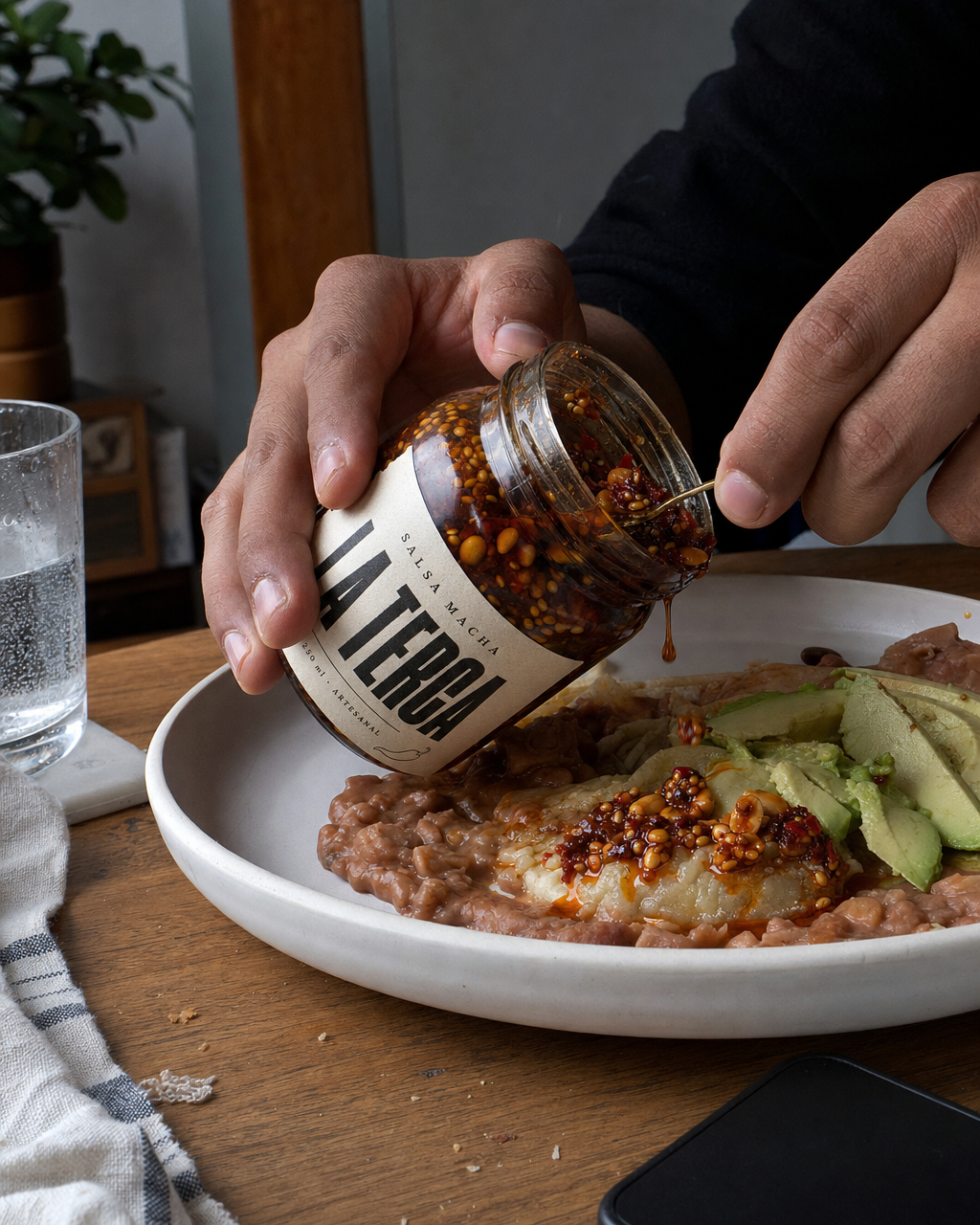
Las tres claves: manos de verdad · luz de ventana · nada acomodado.
Para qué sirve: es la que no parece anuncio, y por eso funciona. Se lee como la foto que subiría un cliente contento, y en redes esas casi siempre le ganan a las pulidas.
Ver el prompt completo ↓Plegar el prompt ↑
$ PRODUCT FIDELITY RULE — non negotiable: use the uploaded image as the exact product reference. The jar shape, the black metal screw cap, the off-white deckled paper label, the brand name LA TERCA, the words SALSA MACHA and 250 ml · ARTESANAL, the small chili line drawing, the typography and the colour and texture of the chili oil with its suspended seeds, peanuts and chili pieces must stay 100% identical to the reference. Do not redesign the label, do not invent or translate any text, do not distort the jar. The product must read instantly as the same product.

THE SHOT: a candid, unstyled photograph that does not look like an advertisement at all. A pair of real hands — warm brown skin, short unpolished nails, a little visible wear, no jewellery — tips the open jar over a white ceramic plate of food on a home kitchen table, letting a thick spoonful of the chili oil fall onto it. The label faces the camera clearly but casually, slightly off-axis.
The table is a real one: a worn wooden surface, a folded cloth napkin, a glass of water with condensation, a couple of crumbs, a phone face down at the edge of the frame. Nothing is perfectly arranged.
LIGHTING: soft natural daylight coming through a window off to the left, no flash, gentle falloff into the room behind, a slightly cooler colour temperature in the shadows.
CAMERA: shot from the eye level of someone sitting at the table, handheld, 35mm, mild natural motion in the pouring oil.
MOOD: honest, homemade, human. This is the shot that reads as a real customer photo and outperforms the polished ones on social.

Photorealistic, shot on a full-frame camera, commercial advertising quality, accurate glass refraction and realistic oil viscosity. No watermark, no captions, no added logos and no text anywhere in the frame other than what is printed on the product label itself.6. Macro sensorial
Las tres claves: la gota antes de caer · contraluz · foco de un milímetro.
Para qué sirve: da hambre antes de leer una sola palabra. Es la que vende la textura, no el producto: sirve para cualquier cosa que se vierta, se derrita, se unte o se sirva.
Ver el prompt completo ↓Plegar el prompt ↑
$ PRODUCT FIDELITY RULE — non negotiable: use the uploaded image as the exact product reference. The jar shape, the black metal screw cap, the off-white deckled paper label, the brand name LA TERCA, the words SALSA MACHA and 250 ml · ARTESANAL, the small chili line drawing, the typography and the colour and texture of the chili oil with its suspended seeds, peanuts and chili pieces must stay 100% identical to the reference. Do not redesign the label, do not invent or translate any text, do not distort the jar. The product must read instantly as the same product.

THE SHOT: an extreme macro, filling the entire frame, of a single thick drop of the chili oil hanging from the rim of the open jar at the instant before it falls. The drop is heavy, glossy and translucent, holding a tiny suspended sesame seed inside it, and the light passing through turns it deep glowing red-amber.
The rim of the jar and the edge of the label are visible along the top of the frame, sharp enough to identify the product, and everything beyond that dissolves into a soft dark bokeh.
Visible detail: the viscosity of the oil stretching as the drop forms, the microscopic texture of the toasted sesame, tiny specular pinpoints across the oil surface, a single fine thread of oil connecting the drop to the rim.
LIGHTING: a hard backlight directly behind the drop making it glow from within, plus a small silver reflector on the left putting one crisp highlight on its surface.
CAMERA: 100mm macro at a wide aperture, razor-thin plane of focus on the drop itself.
MOOD: sensory, mouth-watering, tactile. The shot that makes someone hungry before they have read a single word.

Photorealistic, shot on a full-frame camera, commercial advertising quality, accurate glass refraction and realistic oil viscosity. No watermark, no captions, no added logos and no text anywhere in the frame other than what is printed on the product label itself.7. El origen
Las tres claves: cenital · ingredientes crudos · desorden honesto.
Para qué sirve: es la que justifica el precio. Enseña de qué está hecho y con qué manos, que es la única respuesta real a "¿por qué cuesta más que el del súper?".
Ver el prompt completo ↓Plegar el prompt ↑
$ PRODUCT FIDELITY RULE — non negotiable: use the uploaded image as the exact product reference. The jar shape, the black metal screw cap, the off-white deckled paper label, the brand name LA TERCA, the words SALSA MACHA and 250 ml · ARTESANAL, the small chili line drawing, the typography and the colour and texture of the chili oil with its suspended seeds, peanuts and chili pieces must stay 100% identical to the reference. Do not redesign the label, do not invent or translate any text, do not distort the jar. The product must read instantly as the same product.

THE SHOT: an overhead flat-lay that tells the story of how the product is made. The jar lies at the centre of a weathered dark wooden table, surrounded by its raw ingredients arranged with the honest disorder of a real market stall rather than a styled set: piles of dried chiles de arbol and chiles morita, a scattering of unshelled peanuts, a small mound of sesame seeds, whole garlic cloves, a battered stone molcajete with a few crushed chiles still in it, and a folded coarse cotton cloth in natural undyed beige.
A few chiles have rolled loose across the wood, and there is a light dusting of chili powder and stray seeds on the table surface.
LIGHTING: a single hard shaft of warm daylight entering from the upper left as if through an open door, throwing long crisp shadows from every ingredient and leaving the corners of the frame in shadow.
CAMERA: directly overhead, 50mm, everything sharp.
MOOD: artisanal, earthy, trustworthy. This is the shot that justifies the price.

Photorealistic, shot on a full-frame camera, commercial advertising quality, accurate glass refraction and realistic oil viscosity. No watermark, no captions, no added logos and no text anywhere in the frame other than what is printed on the product label itself.8. El espectacular
Las tres claves: valla real · avenida al anochecer · coches en movimiento.
Para qué sirve: es el mockup con el que le cierras la venta a un cliente. Ver su marca en un espectacular de verdad, en una calle de verdad, hace el trabajo que no hace ninguna presentación.
Ver el prompt completo ↓Plegar el prompt ↑
$ PRODUCT FIDELITY RULE — non negotiable: use the uploaded image as the exact product reference. The jar shape, the black metal screw cap, the off-white deckled paper label, the brand name LA TERCA, the words SALSA MACHA and 250 ml · ARTESANAL, the small chili line drawing, the typography and the colour and texture of the chili oil with its suspended seeds, peanuts and chili pieces must stay 100% identical to the reference. Do not redesign the label, do not invent or translate any text, do not distort the jar. The product must read instantly as the same product.

THE SHOT: a real-world photograph of a large outdoor billboard carrying an advertisement for this product, seen from street level.
The billboard is a genuine painted-steel structure mounted above a busy Latin American avenue, and the poster on it shows the jar photographed as a clean hero shot on a deep red background, with the brand name reading large beside it. The poster respects the product exactly as in the reference.
Around the billboard: real city context at dusk — the tops of buildings, tangled power lines, the glow of shopfronts starting to switch on, headlights streaking along the avenue below, a couple of pedestrians on the sidewalk at the bottom of the frame, all at true scale and slightly motion-blurred.
The billboard is lit by its own row of floodlights along the bottom edge, which spill upward across the poster and make it the brightest thing in the frame against the deep blue evening sky.
CAMERA: shot from the opposite sidewalk with a 35mm lens, slight upward angle, natural perspective distortion on the billboard structure.
MOOD: it has to look like a photograph someone actually took of a real ad in a real city. This is the mockup you show the business owner to close the sale.

Photorealistic, shot on a full-frame camera, commercial advertising quality, accurate glass refraction and realistic oil viscosity. No watermark, no captions, no added logos and no text anywhere in the frame other than what is printed on the product label itself.Cómo adaptarlo a tu producto
Los ocho prompts se dividen en dos partes: el bloqueo del producto (el primer párrafo, igual en los ocho) y la escena (todo lo demás). La escena no la toques: está escrita para funcionar con cualquier producto. Lo único que cambias es el bloqueo.
Empieza por esta versión en blanco y complétala con tu producto:
Ver el prompt completo ↓Plegar el prompt ↑
$ PRODUCT FIDELITY RULE — non negotiable: use the uploaded image as the exact product reference. The bottle, the jar shape, the black metal cap, the label paper, the brand name, the typography, the chili illustration, the proportions and the colour of the chili oil must remain 100% identical to the reference in every shot. Do not redesign the label, do not invent new text, do not distort the jar. The product must be immediately recognisable as the same product.Cámbiale solo la lista del centro por las anclas de tu producto, con este criterio:
- La forma del envase — frasco, lata, bolsa, caja, tubo. Con su tapa y su material.
- El material y el color del empaque — papel mate sin recubrir, plástico brillante, cartón kraft, vidrio ámbar. Es lo que le da el "aire" a tu marca.
- Cada palabra impresa, escrita literal y entre comillas — tu nombre de marca, tu categoría, tu contenido neto. Si no la escribes, el modelo la reinventa.
- Lo que se ve del contenido — el color, la textura, si es translúcido, si tiene trozos visibles.
- Cualquier detalle gráfico distintivo — un dibujo, un sello, una franja de color.
Y siempre cierra con las tres prohibiciones: no rediseñar la etiqueta, no inventar ni traducir texto, no deformar el envase.
Después, para cada una de las ocho fórmulas, pega tu bloqueo arriba y la escena tal cual debajo. Ese es todo el trabajo.
Un detalle de las escenas: la 4 y la 7 mencionan chiles, ajonjolí y cacahuates porque el ejemplo es una salsa. Cámbialos por los ingredientes o las materias primas de lo tuyo —granos de café, flores secas, piel curtida, cacao— y el resto de la escena aguanta igual.
Lo que hay que cuidar
- La etiqueta es lo primero que se degrada. Es el punto débil de todo este método. El modelo sostiene bien la forma del envase y el color, pero el texto chico de la etiqueta es lo primero que reescribe. Revísalo siempre ampliando la imagen, no a tamaño de miniatura.
- El texto grande sobrevive; el chico no. Medido en el ejemplo: el nombre de marca (LA TERCA) y la categoría (SALSA MACHA) aguantaron intactos, mientras que la línea pequeña "250 ml · ARTESANAL" llegó a salir como "ARTSSANAL". Si algo tiene que leerse sí o sí, que sea grande.
- Usa un nombre de marca de una o dos palabras cortas. Mientras más corto y más grande vaya en la etiqueta, menos oportunidades tiene el modelo de equivocarse. Los nombres largos, en dos líneas o con letra chica, salen mal una de cada tres veces.
- Si además lo vas a animar: seis segundos y ni uno más. Al pasar estas fotos a video, la etiqueta aguanta legible unos 6 segundos; a partir de ahí el modelo empieza a reescribir la letra chica. Corta el clip antes de que eso pase.
- En video, movimiento lento y cámara casi quieta. Cualquier giro que muestre la etiqueta en ángulo la destroza: el modelo tiene que reconstruir el texto en perspectiva y ahí es donde inventa. Un empuje lento de cámara, o nada, y que se mueva todo lo demás.
- Verifica antes de publicar, siempre. Amplía la etiqueta al 100% y lee palabra por palabra. Una errata en tu propia marca, publicada, cuesta más que las ocho fotos.